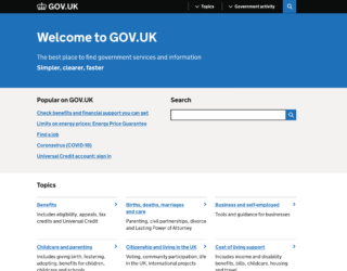
At Public Digital, we know a lot about websites. Our founders led the design and development of GOV.UK, and many of our team, network and partners have contributed to its evolution over the years.
So we are always getting asked the question: “How do I get my government site to be like GOV.UK?”. The answer: it’s complicated.
GOV.UK is much more than a website, and much more than its home page or its design system. It embodies a radical reform of skills, structures and ways of working that aren’t visible from the outside.

Image: @ilyapavlov
Now 10 years old, the design and shape of GOV.UK has become the paradigm of a government website. But what we’ve seen in the last decade is that while others have superficially replicated this paradigm, the skills, capabilities and governance that support it often remain unchanged.
The fact is that websites matter. If someone chooses to interact with a government digitally, the first thing they see is the website. Government websites are often neglected, meaning they tend to be confusing, slow, poor quality, and under-resourced. The inadequacy of websites, in turn, creates hidden failure demand that drives people toward expensive face to face support or commercial offers which pick up the gap.
In summary, websites matter, and perfecting them is difficult. So we have compiled 5 simple things you can do to start to improve your government site:
Remember that users start on Google
Data shows that the first thing people do when they want to solve a problem is to ask Google. Most people won’t know which section of government they need to access in order to use a service, so your website will not be their first port of call when they begin their search, and they are unlikely to use your site’s internal navigation. Instead, they will use Google.
The top Google result they land on has to be the one which provides the most direct route to whatever government service that person needs. Effectively, you need a single government page that ranks for a particular search term.
That means:
Write well structured, clear content
Tailor your content to the way people search - i.e. using the language they use
Remove duplicate web pages
Use Google Trends to look at Google search analytics, focusing on KPIs like bounce rate and time spent on the page
Don’t publish essential information in PDFs

Image: firmbee
Improve your content
From internal search to logo placement, content hierarchies to website images, web teams tend to be empowered to fix the wrong things. The truth is there is only one thing to focus on, and that is what your user has come to your website to do.
At Public Digital we talk about starting with user needs, or the ‘Jobs-to-be-Done’ framework, as this impels you to consider the basics: what job your user is really trying to do. Your job is to make this process as easy as possible for them.
That means:
Treat writing for the web seriously. It is not for juniors and interns: It is a profession and a distinct skill.
Distinguish content design from government communications and policy writing and running training accordingly
Map out who owns your content
Design a publishing and quality assurance model
Be laser-focused on conversion
Failure demand is defined by John Seddon as “the demand caused by a failure to do something or do something right for the customer.“ While the job of a service is to enable users to meet their needs, the job of the team behind it is to examine to what extent that service is succeeding and why.
You need to interrogate the data to find out why users are bouncing, where they are dropping out, and how many times they have to click before the webpage they reach matches their search term.
That means:
Define measures for success, avoiding vanity metrics
Implement analytics, examine them, and act on them
Talk to front line teams, such as contact centre staff
Carry out user research (i.e. direct observation of people to understand what they do, not what they say)

Prioritise top user needs
Everyone has finite resources; you will have more impact if you prioritise and focus on information and services with high volume and high frequency use. These are your top user needs. In the UK, those include services like registering to vote, paying tax, and applying for a birth certificate. You may also be grappling with issues which are high impact or politically important: these should be part of a balanced list of priorities too.
That means:
Use data to quantify demand and service usage
Decide how you will prioritise, and make the list finite.
Make sure that teams, senior leaders and governance forums understand the top user needs and refer to them in everything you do.
Remember that performance is access
There is no use designing high-quality content and offering digital services if accessing your site is expensive and slow for users.
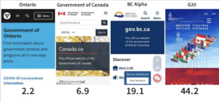
In many countries, data is costly and infrastructure is patchy. When a government website is poorly designed, it will drain a user’s data allowance and restrict their access to services. And even for those that are able to, the experience of using the site will be slow and excruciating.
That means:
Prioritise speed and performance over beauty.
Regularly test site performance in a range of scenarios

Image: The time required to load four government websites using 4G.
This article is based on a presentation delivered by Public Digital partner Emma Gawen to FWD50, a gathering of leading public sector innovators held this year in Ottawa between the 1st and 3rd November.
Public Digital is a proud supporter of FWD50. We are part of the content advisory board, where we help to steer the content and format of the annual event. We look forward to preparing for FWD50 in 2023.
No comments yet